Ten fictional ACME examples show how to direct the first fixation, build a visual path and make the message easier to follow.
Designing attention means choosing the visual entry, constructing the path and controlling the destination. Each example pairs an original ACME slide with its predicted attention map to show how those decisions work in practice.
Key Takeaways
- Attention can be designed. Decide where the eye should enter, what it should inspect next and where the visual path should end.
- A slide attracts attention through hierarchy, not decoration. Scale, position, contrast and spacing define the first scan.
- Every extra entry point creates competition. A slide needs one deliberate attentional promise, even when it contains several useful elements.
- Dense executive slides can work when information is organized into primary, secondary and supporting layers.
- Images, faces, maps and diagrams are powerful attention magnets and must be aligned with the argument.
- A cognitive heatmap predicts perceptual pull; it supports design judgment but does not replace audience knowledge or eye-tracking.
Attention is not captured by accident. It is designed
Presenters experience a slide as a story: they remember why each element is there and in which order it should be explained. The audience encounters something different – a visual field that must be scanned before it can be interpreted. That first scan is fast, selective and largely driven by perceptual signals.
When the strongest hotspot supports the message, comprehension starts quickly. When it points to a logo, a decorative image or a secondary number, the audience begins with a detour.
A slide attracts attention when its strongest visual signal supports its strongest idea.
The examples in this article use fictional ACME Corp data and newly created visuals. They reproduce common corporate formats – KPI pages, comparisons, timelines, operating models and executive summaries – without using client information.
See whether your slide attracts the right attention
Upload a PNG or JPG to the free MLC Cognitive Heatmap and compare the predicted attention path with the message you intended.
What a cognitive heatmap can – and cannot – tell you
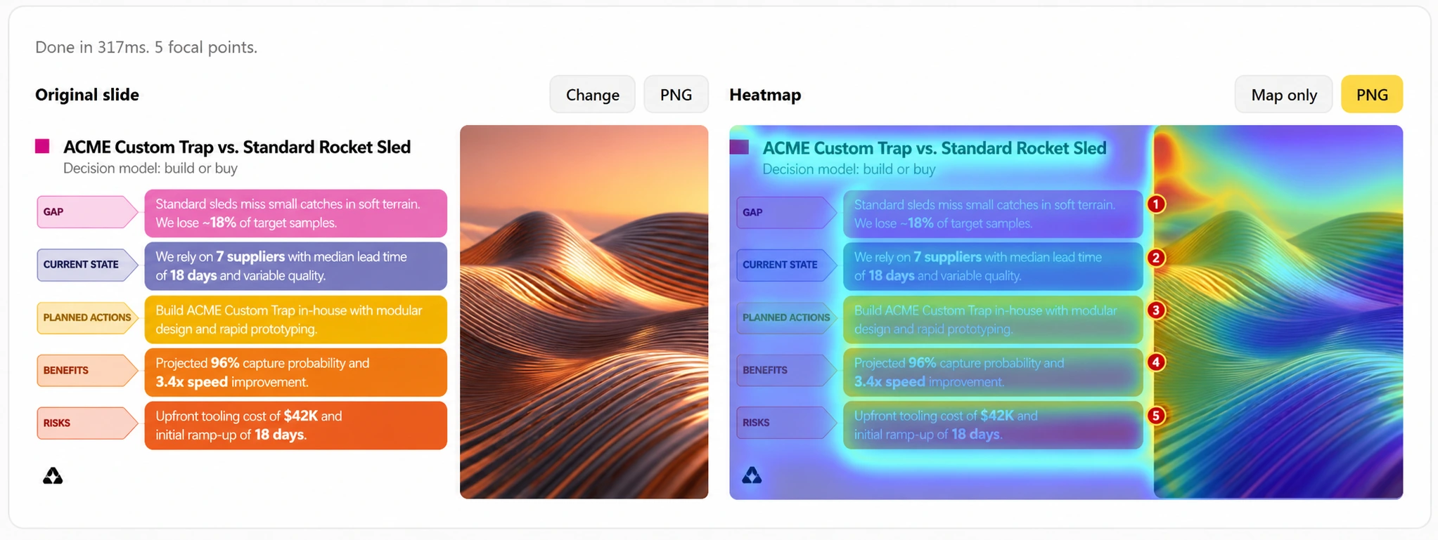
The MLC Cognitive Heatmap combines bottom-up saliency, the F-pattern reading bias and face detection. It estimates which areas are likely to attract the eye because of contrast, intensity, orientation, position and human faces.
This creates a useful design hypothesis before the meeting. The map can reveal that the title dominates everything else, that a photograph pulls attention away from the decision, or that several equally strong blocks create a scattered scan.
The map does not know the audience's objectives, political context or prior knowledge. Treat it as a prediction of perceptual pull, then combine it with relevance: what this specific audience has come to understand, decide or do.
Seven principles for designing attention on a slide
1. Design the first fixation around the message
Before adjusting colors or icons, decide where the audience should look first. A conclusion slide may need one dominant result. A comparison may need two balanced anchors. The first fixation is not a cosmetic detail: it frames everything that follows.
2. Limit the number of competing entry points
A slide can contain many elements without offering many beginnings. Grouping, consistent alignment and controlled contrast allow supporting information to remain available without demanding immediate attention. If every block calls for the first look, the audience must invent its own route.
3. Build sequence into the geometry
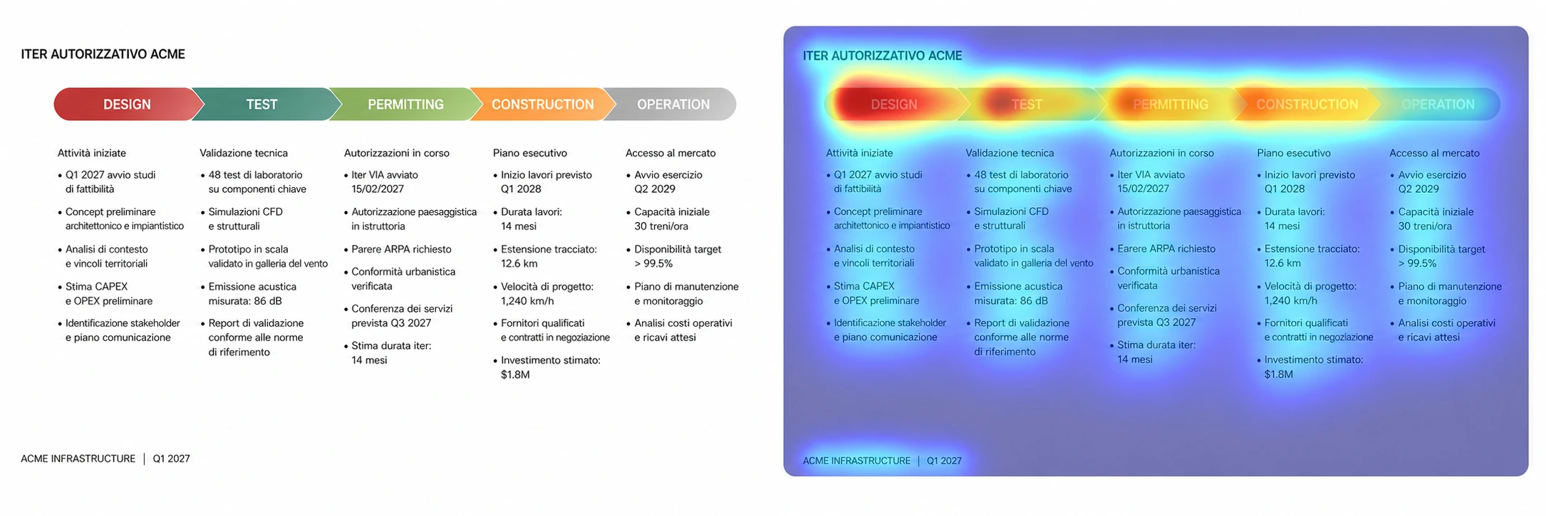
The strongest paths are encoded in alignment, proximity and progression. A left-to-right timeline works because the geometry carries the sequence before the labels are read. A process diagram works when the next node is visually inevitable.
4. Structure beats decoration
The before-and-after integration examples keep almost the same content while changing the reading experience. Grouping related elements, opening space and clarifying the dominant block reduce uncertainty before any additional decoration is introduced.
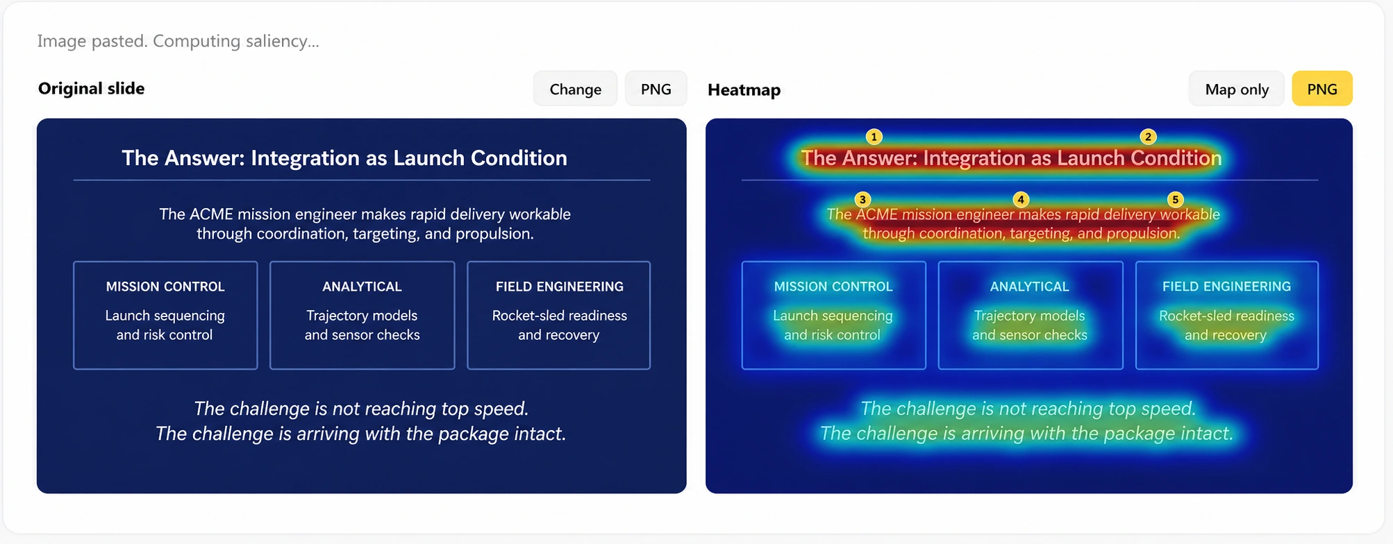
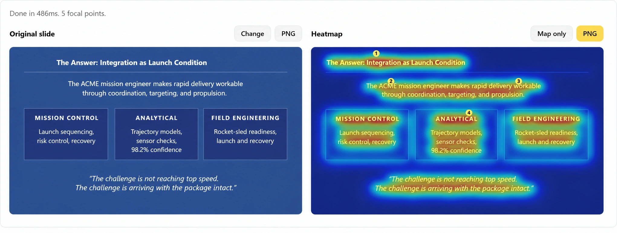
The redesign changes the path more than the content: grouping and spacing do the heavy lifting.
5. Dense slides need levels, not emptiness
Executives often need dense slides. The answer is not to split every dashboard into ten pages. The answer is to create layers: primary result, secondary evidence and supporting detail. Density becomes manageable when hierarchy tells the audience where to enter, what to compare and what can wait.
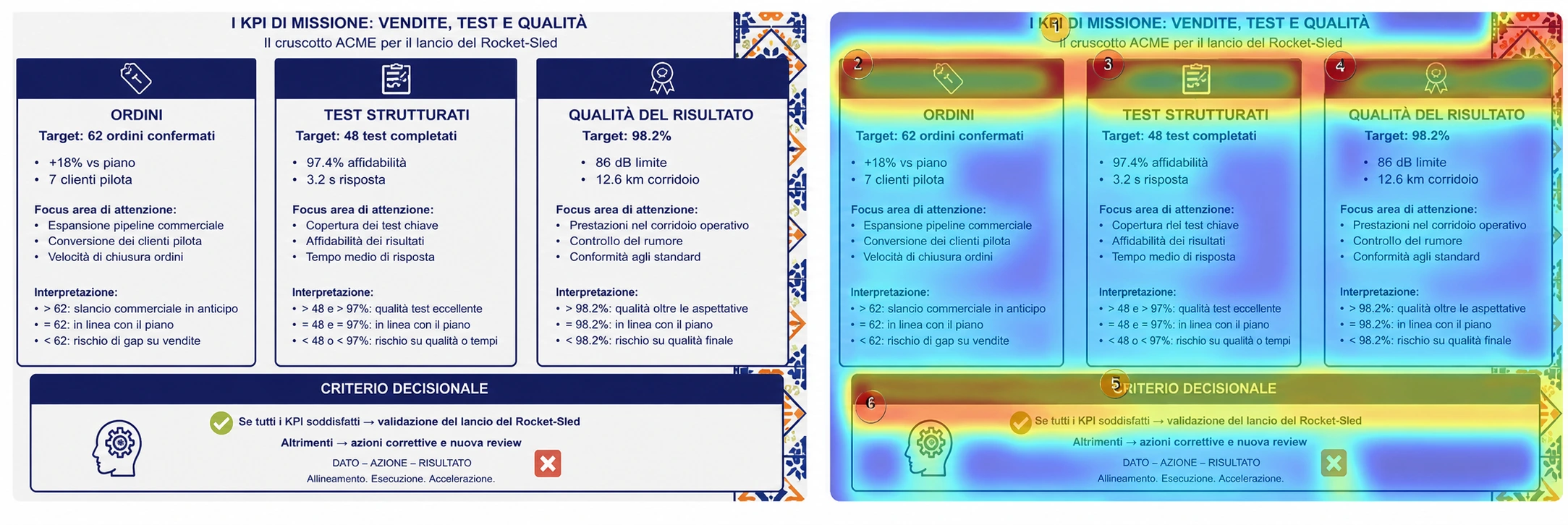
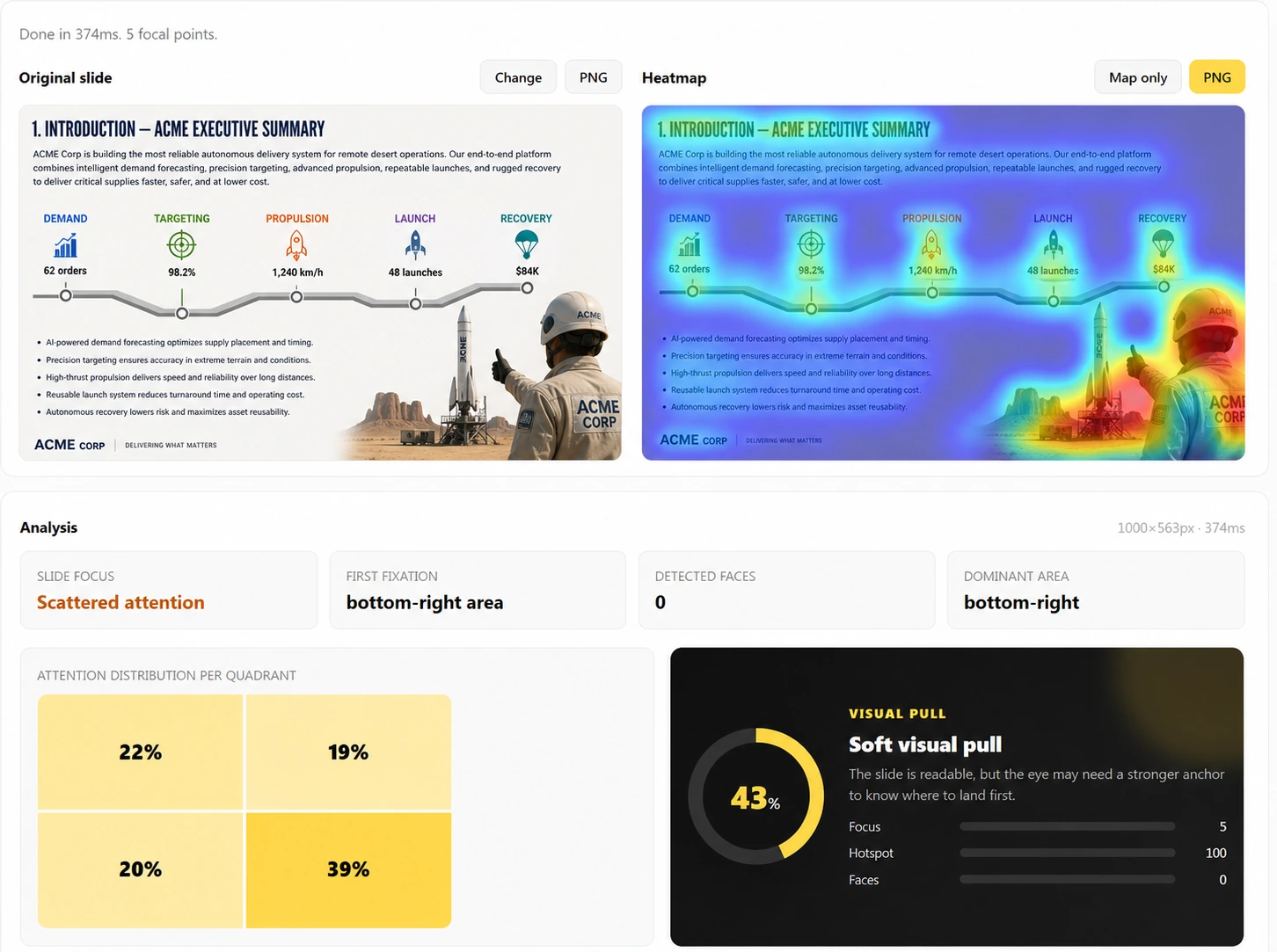
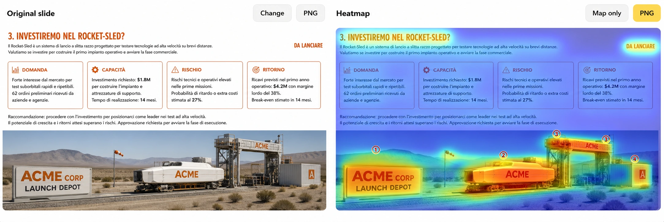
6. Images and diagrams can hijack the message
Visuals attract attention quickly, which is precisely why they must earn their place. A face may win the first fixation, a map may dominate supporting context and a diagram may pull the eye into a loop. Place the message beside these magnets, integrate the evidence into them or reduce their contrast.
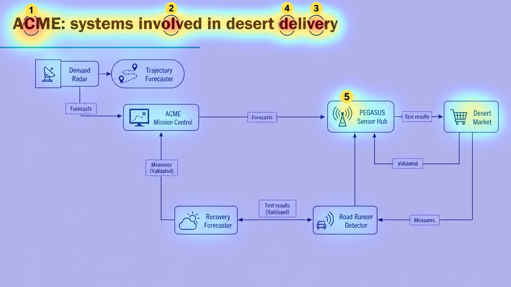
7. Design the exit as carefully as the entry
A useful slide has three attentional jobs. Entry: where should the eye land? Path: what should it inspect next? Exit: what thought or action should remain when people look back at the speaker? Most slides are designed only for the middle. They contain information but no deliberate beginning or conclusion.
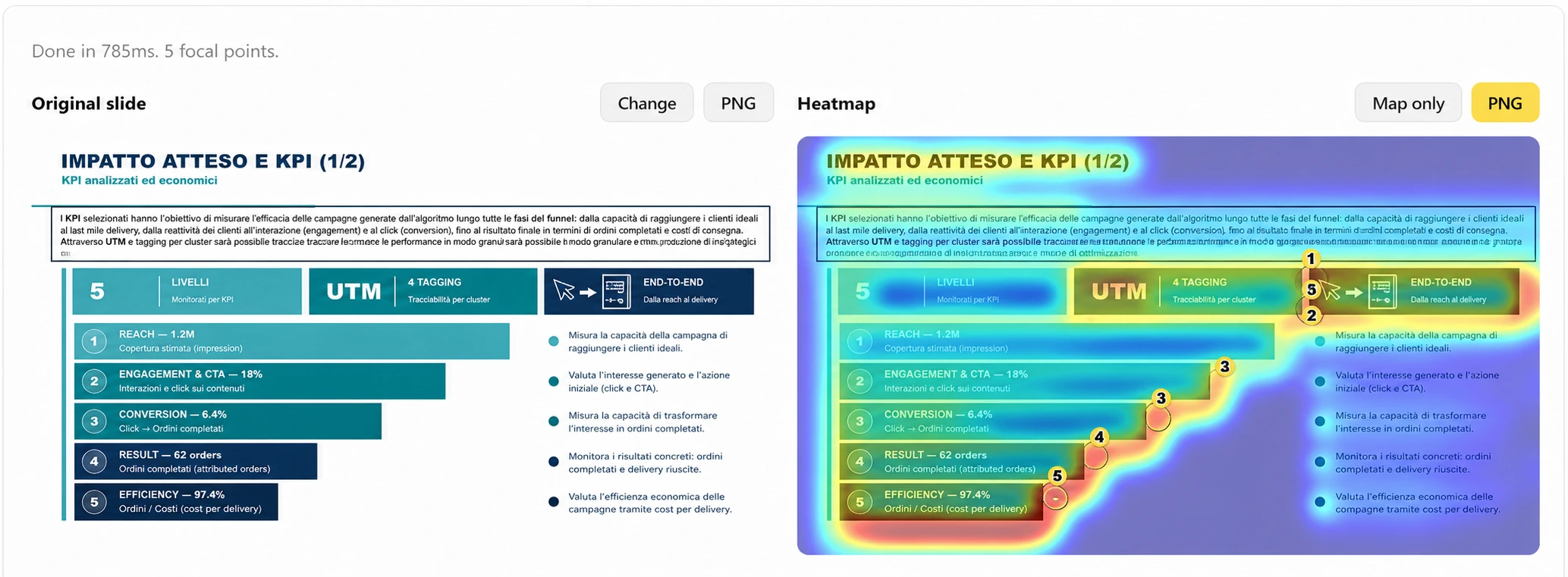
A five-minute attention review before every important presentation
- Export the slide as a PNG or take a clean screenshot.
- Run it through the MLC Cognitive Heatmap before rehearsing.
- Compare the strongest hotspot with the message you want the audience to retain.
- If they do not match, change hierarchy first: reduce competition, resize, regroup or reposition.
- Retest, then rehearse the verbal explanation against the predicted visual path.
The objective is not a perfect score. It is an intentional perceptual behavior. When the visual path and the narrative path agree, the audience spends less effort decoding and more effort deciding.
Design attention, not decoration
Attention is a scarce design resource. Every object that attracts the eye should either establish the message, provide evidence or move the audience toward the decision. If it does none of those jobs, it is consuming attention without creating value.
This is the practical contribution of Neuro Presentation Design: not decorating slides, but designing the perceptual path that makes the right information easy to notice, easy to follow and easy to act on.
Choose the entry. Build the path. Land the decision.
Build a slide that attracts attention where it matters
Run one real slide through the free MLC Cognitive Heatmap and compare the result with the route you intended.
Frequently Asked Questions
How do you design attention on a slide?
Choose the intended first fixation, create a clear visual route through the evidence and give the audience a deliberate final takeaway. Then use hierarchy, contrast, position and spacing to make that path visible.
What does a cognitive heatmap measure?
It predicts perceptual saliency: the areas most likely to attract attention because of visual properties such as contrast, position, intensity, orientation and faces.
Is the MLC Cognitive Heatmap the same as eye-tracking?
No. It is a predictive design diagnostic. It does not record the gaze of a real participant and should be combined with audience knowledge and presentation strategy.
What should I change first when the heatmap is scattered?
Start by reducing competing entry points. Clarify the title, enlarge the key result, group related evidence and lower the contrast of supporting elements.



Comments on How to Design Attention in PowerPoint: Build Slides That Attract the Eye