Haier
Visual ID Haier Sustainability
Challenge
The sustainability department of Haier, a globally renowned appliance company, needed a visual identity that would not only resonate with the company’s core values but also represent the company’s commitment to sustainability, innovation, and excellence.
Intervention
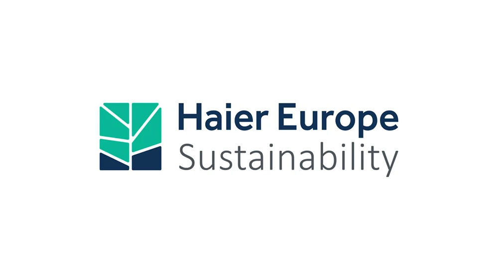
Our team conducted an in-depth analysis of Haier’s brand, seeking to thoroughly understand its core values and beliefs, particularly its dedication to sustainability. We then developed a new logo that captures the essence of the brand and incorporates elements representing eco-friendliness, technological advancements, and Haier’s legacy.
Outcome
The new visual identity effectively communicates the company’s ethos and purpose. The visual identity manual ensured that the brand’s portrayal remained consistent, further solidifying its presence in the industry.
• The logo integrates Haier Europe’s branding and patterns with an abstract representation of a tree. It presents a design where segments reminiscent of leaves come together, suggesting a fusion of the natural world with technological precision. The dominant shades of teal and navy blue, paired with the contemporary blue typography, reflect both the environment and innovation.
• Along with the logo, we developed a visual identity manual that outlined clear guidelines on logo usage, ensuring consistency across all platforms and touchpoints.
Frequently asked questions
What identity design challenge did Haier bring to MLC?
Haier needed a visual identity expressing its values and commitment to sustainability, innovation and excellence.
How did MLC approach Haier’s sustainability-related logo?
MLC analysed the brand and developed a logo combining Haier Europe’s identity with an abstract tree to represent sustainability.
Why were guidelines part of Haier’s identity project?
The guidelines provided a shared reference for consistent logo use and a coherent representation of the identity across applications.
