Most presentation teams do not suffer from a lack of ideas. They suffer from accumulated material: old slides, duplicate charts, inconsistent layouts, last-minute edits and templates that nobody quite follows. The result is familiar—a deck that takes too long to build and even longer to understand.
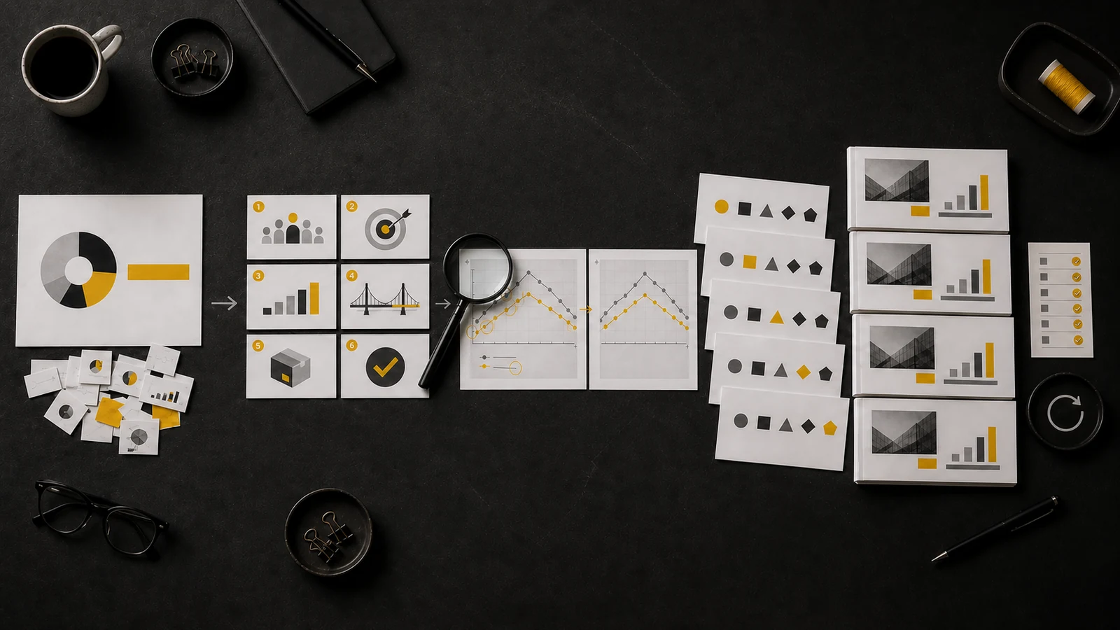
The 5S of Lean Presentation Design turn that clutter into a practical workflow. Adapted from the Lean pillars Seiri, Seiton, Seiso, Seiketsu and Shitsuke, they help you select what matters, arrange it, inspect it, standardize it and keep the standard alive. This 5S Lean Presentation Design workflow does not simply make slides look cleaner. It moves them from raw input to clear, repeatable impact.
Key Takeaways
• Seiri selects: it removes material that does not support the audience’s decision, without rearranging or redesigning what remains.
• Seiton orders: it gives every selected element a precise position and creates a reading path, without deleting content.
• Seiso inspects: it exposes and corrects visual defects while keeping the message, data and sequence unchanged.
• Seiketsu standardizes: it turns a successful solution into a reusable template system, such as a family of linked section dividers.
• Shitsuke sustains: it makes compliance with an existing standard a recurring habit through ownership, reviews and short retrospectives.
The 5S are not five generic design tips
The original 5S method organizes a workplace, makes problems visible and prevents good practices from disappearing over time. A presentation is also a workplace—only the person working in it is your audience. While you speak, people must find the message, connect it to the evidence and understand what to do next.
This is why the 5S do not replace the broader Lean Presentation Design methodology, nor do they compete with general presentation design principles. They provide a specific operating sequence for transforming a deck and preserving the result.
Five questions keep the principles separate
- Seiri: What deserves to remain in the main flow?
- Seiton: Where should each selected element go?
- Seiso: Which errors must I identify and correct in what remains?
- Seiketsu: Which rules should I encode so that the solution can be reused?
- Shitsuke: How will I verify that the existing standard is respected over time?
That distinction matters. If one example could illustrate two or three principles equally well, it is probably too vague. In the examples below, each transformation changes one lever only.
1. Seiri — Sort: remove what does not serve the decision
Seiri is selection. Every slide, chart and sentence must earn the right to stay by helping the audience understand the message or make the required decision. Material that fails the test does not always need to be deleted forever. It may belong in the speaker notes, a pre-read or an appendix.
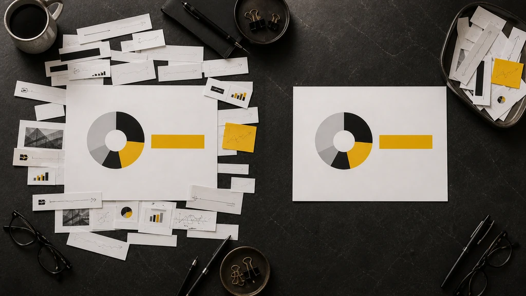
Imagine an HR team asking an executive committee to approve a three-month onboarding pilot. The working deck contains a central chart that compares the pilot options, but it is surrounded by old screenshots, secondary benchmarks, repeated quotations and exploratory charts. In the Seiri transformation, the central chart does not move and is not redesigned. The team removes only the fragments that do not contribute to the approval decision.
How to apply Seiri
- Write the decision or desired change in one sentence.
- Inventory every slide, chart, paragraph and appendix without editing them.
- Mark each item as essential, support on request or unnecessary.
- Keep only the evidence required to reach the decision in the main flow.
The Seiri boundary: only the quantity of content changes. The core chart, takeaway and layout remain untouched. If you start moving objects or fixing the palette, you have already moved into another S.
This principle is consistent with the MIT Communication Lab’s advice to determine the message of each slide and remove elements that distract from the takeaway. The practical difference here is procedural: Seiri is the explicit gate that decides what stays in the workflow.
2. Seiton — Set in order: give every selected element a place
After Seiri has reduced the material, Seiton arranges what remains. It works at two levels: the sequence of the deck and the hierarchy inside each slide. Your audience should not have to reconstruct the argument or search for a label far away from the data it explains.
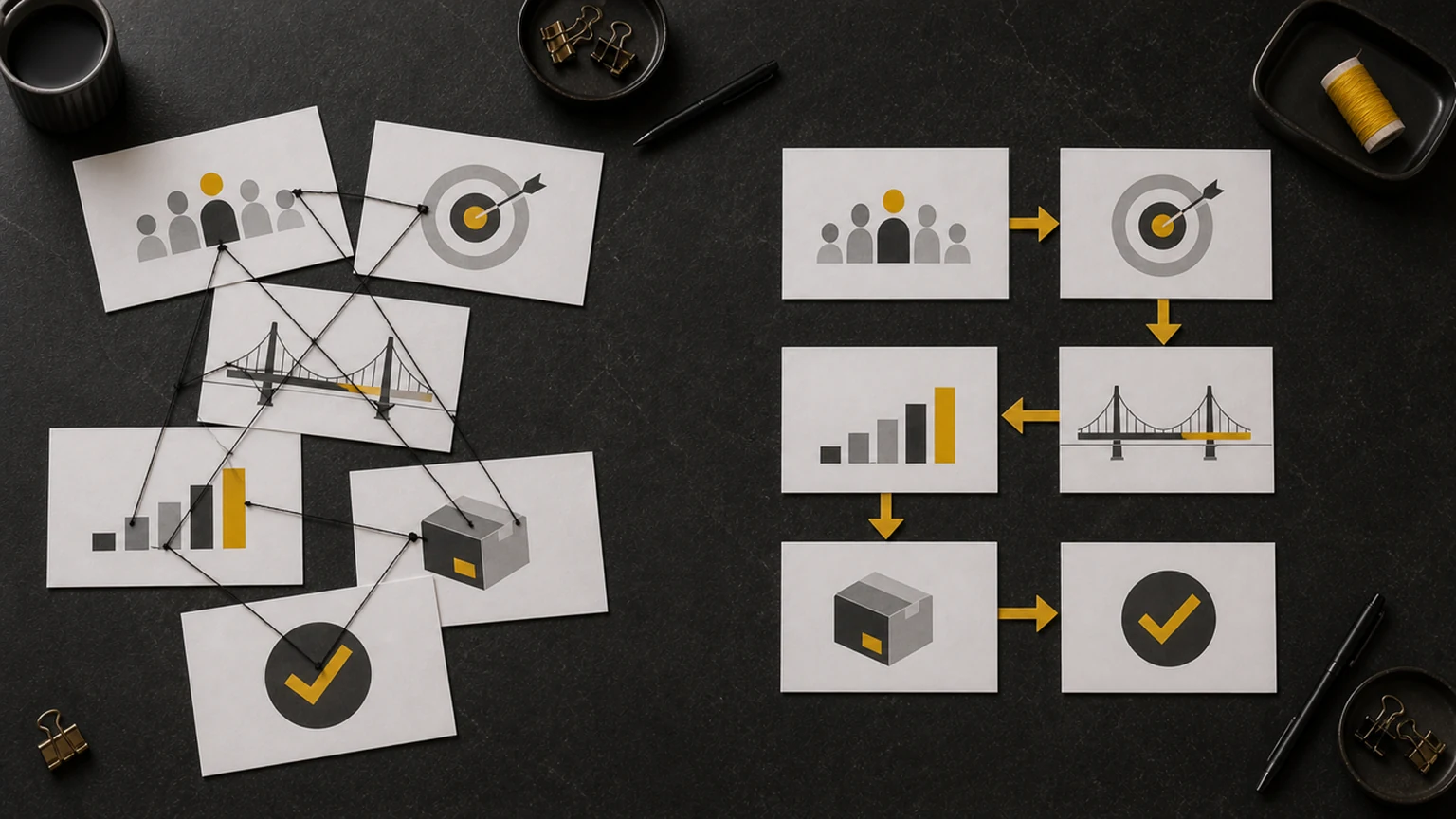
In this example, six presentation slides are already approved: context, problem, evidence, solution, implementation and decision. Before Seiton, all six are present but connected by crossing lines and unclear jumps. After Seiton, the same six slides form one unambiguous path. Nothing is removed, and no slide is visually redesigned.
How to apply Seiton
- Order the deck as a logic chain: context, problem, evidence, solution and decision.
- Turn topic labels into sentence titles that state the message.
- Place the takeaway first, the proof second and supporting detail last.
- Group related objects and label data directly whenever possible.
The Seiton boundary: the inventory is fixed. You are not deciding whether an element deserves to stay; that decision belongs to Seiri. You are deciding where an already selected element must live so that the audience can follow it.
Research on the assertion-evidence approach is relevant here: a sentence headline and visual evidence make the message easier to follow than a generic topic heading followed by a list. Seiton converts that idea into a repeatable ordering discipline.
3. Seiso — Shine: find and fix defects
Seiri has already decided what must remain. Seiso does not remove any more content: it inspects what remains and corrects errors that compromise accuracy, legibility or consistency. In a factory, cleaning reveals leaks, cracks and anomalies; in a presentation, the equivalent is making defects visible—an incorrect value or label, an object out of alignment, insufficient contrast or an overlap.
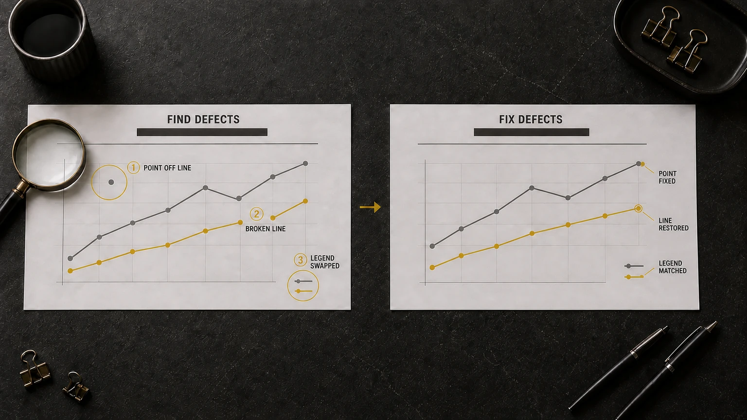
The Seiso example uses the same analytical chart with the same two data series before and after. The inspection identifies three specific defects: an incorrect starting point, one misaligned marker and an incomplete legend. The corrected version fixes only those errors; message, data inventory and sequence remain unchanged.
How to apply Seiso
- Compare numbers, labels, units and sources with the original data.
- Inspect alignment, spacing, overlaps and consistency between the legend and the chart.
- Verify contrast and legibility at the real viewing distance, including in grayscale.
- Correct one defect at a time without changing the message, the data or the quantity of content.
The Seiso boundary: Seiri decides what stays; Seiso checks whether what stays is correct. Here, no element is removed and the story is not reordered. Content and message remain unchanged while only defects in accuracy, alignment and legibility are corrected.
The empirical study Declutter and Focus is a useful reminder that decluttering and directing attention are not cosmetic preferences. They can affect how efficiently readers interpret a visualization.
4. Seiketsu — Standardize: turn one good solution into a system
Seiketsu captures what works and turns it into a reusable system. In presentations, the system may include slide masters, layouts, placeholders, grids, typography, chart rules, units, sources and accessibility requirements. The aim is to make the correct choice easy to repeat and the incorrect choice harder to introduce.
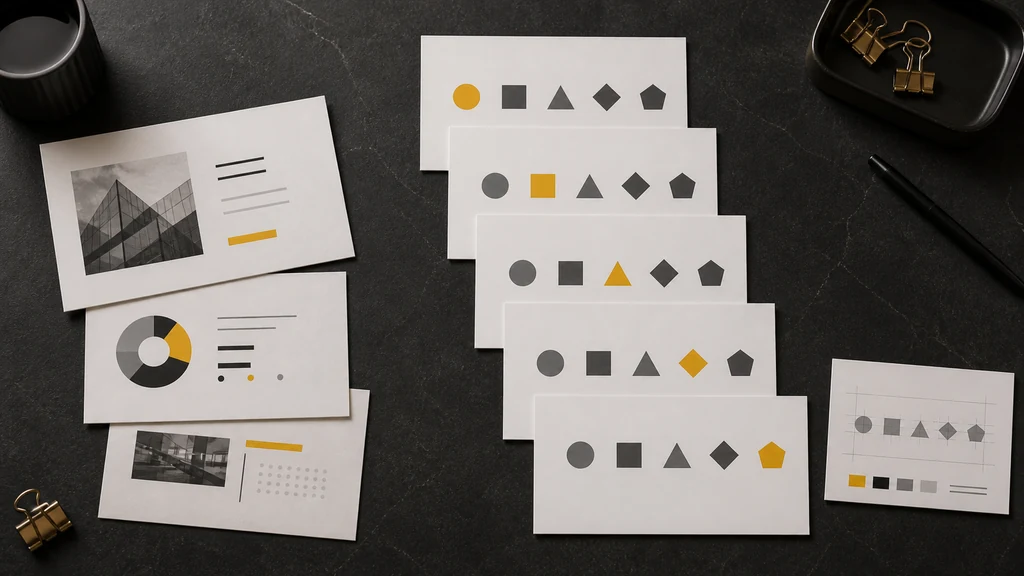
The example is a family of five section dividers. Every slide contains the same five geometric objects—a circle, square, triangle, diamond and pentagon—in the same positions, with identical margins, typography and palette. The template changes one controlled variable: on each divider, a different object lights up in yellow to show the active section. You are not arranging five existing messages. You are defining the matrix that will generate future slides.
How to apply Seiketsu
- Define four or five recurring slide intents: opening, message with evidence, comparison, process and decision.
- Set a type hierarchy, grid, spacing rules and one controlled accent color.
- Standardize charts, dates, units, sources and naming conventions.
- Build the rules into layouts, placeholders and guides instead of leaving them in a forgotten PDF.
The Seiketsu boundary: this is not Seiton at scale. Seiton finds the best place for selected content in one deck. Seiketsu encodes the rule that governs a class of future slides. The distinction is the difference between arranging five slides and designing the mold that will produce fifty consistent slides.
PowerPoint supports this logic through its Slide Master and associated layouts. For the organizational dimension, see MLC’s approach to the corporate PowerPoint template as an efficiency engine.
5. Shitsuke — Sustain: make the standard a habit
Shitsuke is the discipline that keeps the system working when deadlines, copied slides and local exceptions start to pull it apart. It does not design the standard—that is Seiketsu—and it does not continually redesign it. It makes sure that an approved standard is used, checked and learned from.
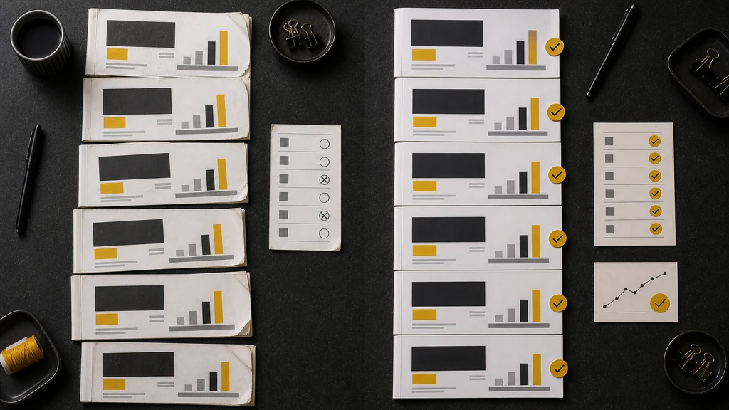
In the example, the template already exists on both sides. The team produces six recurring monthly decks. Without a routine, small exceptions accumulate: an outdated cover, a missing source, a chart copied from the wrong master. With Shitsuke, every delivery passes the same lightweight preflight, has a named owner and ends with a ten-minute reflection. The change is not the template; it is the cadence of verification.
How to apply Shitsuke
- Assign an owner to the presentation system, not only to this month’s file.
- Run a short preflight before each delivery and a deeper review on recurring decks.
- Maintain one trusted master and clearly label local or experimental slides.
- After presenting, spend ten minutes on hansei: what worked, what failed and what should change next time.
The Shitsuke boundary: the template is already designed. If you are still choosing the grid or inventing the divider system, you are doing Seiketsu. Shitsuke begins when the question becomes: “Did we use the agreed system again, and did we check it?”
For teams that produce a high volume of decks, this principle connects naturally with repeatable PowerPoint productivity workflows: reusable assets and automation save time only when ownership and review keep them trustworthy.
How to diagnose which S you need
- Too much material? Start with Seiri.
- The right material is present but difficult to follow? Use Seiton.
- The story is correct but the slide looks unreliable or hard to read? Use Seiso.
- One deck works, but the team rebuilds it every time? Use Seiketsu.
- A template exists, but recurring decks keep drifting away from it? Use Shitsuke.
The sequence is deliberate. You cannot organize material that has not been selected, and there is little value in polishing content that should have been removed. In the same way, there is no point in standardizing a weak solution or auditing a standard that has never been defined.
A 30-minute 5S Lean Presentation Design exercise
Choose one recurring presentation and work in five short sprints. Each sprint must produce a visible output and change only its assigned lever.
- 7 minutes — Seiri: write the required decision and move nonessential slides to an appendix.
- 6 minutes — Seiton: arrange the remaining slides as a logic chain and rewrite their titles as messages.
- 7 minutes — Seiso: inspect five key slides for contrast, alignment, spacing and decoration that competes with evidence.
- 5 minutes — Seiketsu: capture one reusable layout, chart rule or divider family in the master.
- 5 minutes — Shitsuke: define the owner, preflight moment and next review date.
Do not aim for perfection in half an hour. Aim to make the operating logic visible. When the team can name which S it is applying, debate becomes faster: “This slide has too much content” is a Seiri problem; “we already solved this last month but nobody reused it” is a Seiketsu or Shitsuke problem.
The result: less waste, clearer decisions, repeatable quality
The first three S improve the deck in front of you: they select, arrange and expose defects. The last two transform that improvement into organizational capability: they encode the solution and protect it over time.
The real promise of 5S Lean Presentation Design is not a prettier presentation. It is a presentation in which the audience finds the message sooner, understands the evidence more easily and reaches the decision with less friction—while the team reduces rework, inconsistency and repeated design choices.
Start small. Pick the deck your organization creates most often and apply the five questions in order. If you want to turn the method into a shared team capability, explore the Lean Presentation Design training.
Frequently asked questions
What are the 5S in presentation design?
They are Seiri (Sort), Seiton (Set in order), Seiso (Shine), Seiketsu (Standardize) and Shitsuke (Sustain). Applied to presentations, they form an operating sequence for selecting content, organizing it, inspecting visual quality, creating reusable systems and maintaining those systems over time.
What is the difference between Seiton and Seiketsu?
Seiton arranges selected content inside a specific deck or slide. Seiketsu defines a reusable rule that governs future slides—for example, a family of section dividers generated from one master layout.
What is the difference between Seiketsu and Shitsuke?
Seiketsu creates the standard. Shitsuke ensures that people continue to use and verify that already defined standard across recurring deliveries.
Can I use the 5S with Keynote or Google Slides?
Yes. The method is software-independent. PowerPoint, Keynote and Google Slides provide different template and collaboration features, but the five decisions—select, order, inspect, standardize and sustain—remain the same.
Should I apply all five principles to every presentation?
Use all five when building or rebuilding a recurring presentation system. For a one-off deck, the first three may solve the immediate communication problem, but Seiketsu and Shitsuke become essential as soon as the solution must scale across people or time.



Comments on The 5S of Lean Presentation Design: a practical guide with real slide examples